
Appearance
AdminSite Settings → Appearance
Control the visual identity of your tenant — logo, favicon, brand colours, and the login page hero image.
Open Settings → Site Settings → Appearance.
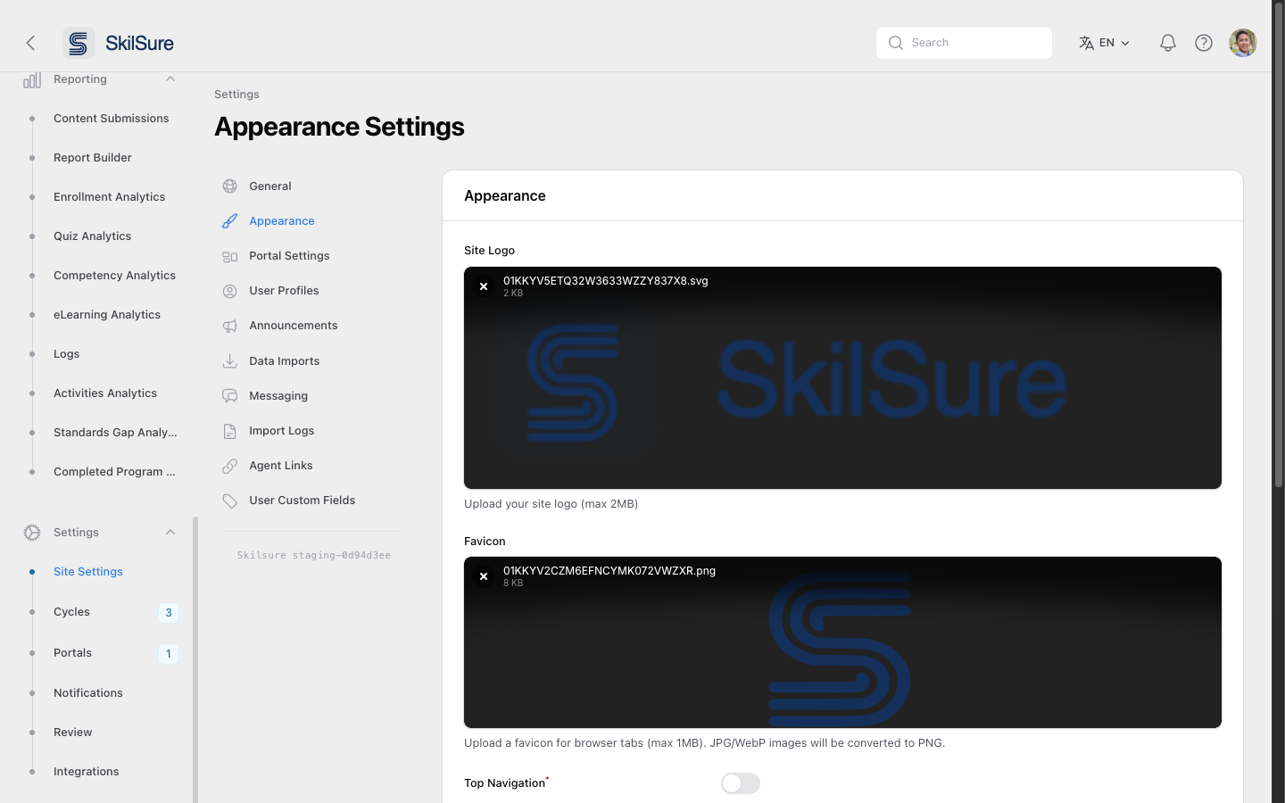 Appearance Settings. Top: brand assets (logo, favicon). Below: navigation layout, colours, and the login page background.
Brand assets
- Site Logo — uploaded as an image or SVG (max 2 MB). Appears in the top-left of every authenticated page. SVG is recommended so it scales sharply on retina displays.
- Favicon — the browser-tab icon (max 1 MB). JPG and WebP uploads are auto-converted to PNG.
Layout & colour
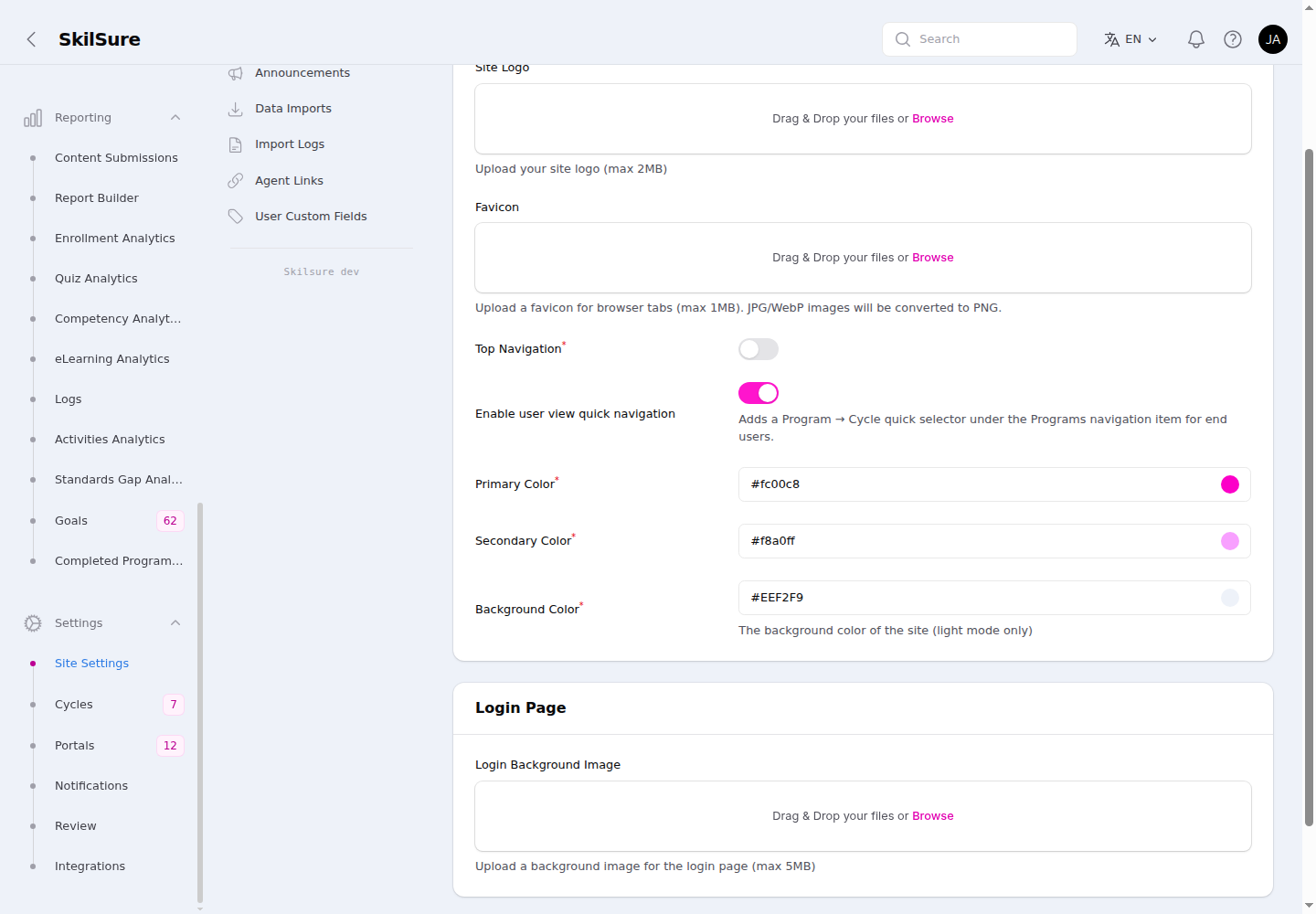 Below the brand assets: the navigation toggles, colour palette, and the login page background.
- Top Navigation — when on, the main menu sits across the top bar instead of in a left sidebar. When off (default), users get the left-rail layout shown throughout this guide.
- Enable user view quick navigation — when on, a Program → Cycle quick selector appears under the Programs navigation item in the user view, letting users jump straight to any of their enrollments. Off by default. Works in both the sidebar and top-navigation layouts.
- Primary Color — the dominant accent. Used for buttons, links, and active nav states.
- Secondary Color — supporting accent colour used by some components.
- Background Color — page background in light mode only. Dark mode uses a system-managed dark surface.
Use hex values (e.g. #1777ac). The colour picker on the right of each field opens a swatch picker.
Login Page
- Login Background Image — the full-bleed image behind the login form (max 5 MB). A wide landscape image works best — text from the form sits in the centre.
Click Save changes to publish. The new look is visible on the next page load — including to anyone who reaches the login screen.
Brand colour conflicts
If the primary colour clashes with status badges (success greens, error reds), test a few different shades. Aim for a primary that has enough contrast with white text for buttons.